Harvest, closer to home.
A calm hydroponic tower, pre-seeded pods and an app that let busy city people grow herbs and greens at home, with almost no effort.


Overview
City dwellers want fresh, clean food but lack space, time and know-how. Most home growers give up.
A modular Kratky tower, pre-seeded pods and a calm app that only speaks up when it matters.
Led UI design and prototyping (design system plus four core flows) and led user research.
Red Dot Design Concept winner and European Product Design Award honorable mention (2026), backed by a full UX and business strategy.
Everyone wants fresh food.
City life gets in the way.
Food travels far, often carries chemical residues, and most city homes have no room to grow it.
Two kinds of city growers
Young professionals
Time-poor, values-driven, living in compact apartments. They care how food is grown but won't take on a needy hobby.
Meet Julie: wants to eat cleaner and feel connected to her food, without adding complexity to a busy life.

What we heard, and what was missing
A survey of potential users, a scan of six competitors and a lot of reading on how plants actually grow.
“What matters most to you in a home-growing system?”
Convenience came first, ahead of health and freshness.
“What would you pay?”
One-time, for the system
- Under $100
- $100–200
- Over $200
Monthly, for refills
- Under $10
- $10–25
77.7% expect to pay under $200, while most smart gardens cost $250 to $900.
Competitors pick one lane
Most indoor gardens chase automation or yield, which brings cost, complexity and data-heavy apps. We aimed for the overlap. Hover a brand.
Harvesto: performance, simplicity and a home it belongs in.
Three calls that shaped Harvesto
Each one traded features for calm. Here is what we weighed and why we chose what we did.
How should the plants grow?
We compared five hydroponic methods. Hydroponics already uses far less water than soil and needs no soil at all, but most methods depend on pumps that run all day.
We chose Kratky. It is passive: nothing to break, nothing to hear, nothing to time. That fits beginners who travel and forget.
UF/IFAS on Kratky ↗Kratky: Passive: roots sit in still nutrient water. No pumps, no air stones, no timers.
What goes into the tower?
Seeds need something to sit in. Rockwool is the industry default, but it never breaks down and sheds irritating fibres. Loose seeds mean guesswork.
We chose pre-seeded sponge pods. Drop one in a slot and you have planted. A QR code on each pack tells the app what is growing and when to harvest.
On rockwool's downsides ↗How smart should it be?
We were tempted by a sensor for everything. Then we costed it. Competitors were already $250 to $900, some with monthly AI memberships, and our survey said most people expect to pay far less. Extra sensors also made the app louder and the setup longer.
We kept only what matters. The tower works without sensors. One optional pack (water level, pH and nutrients, temperature and humidity) adds alerts for people who want them, and the modular floors let people start small.
Build a tower
↑ 77.7% of surveyed users expect to pay under $200
Harvesto prices are concept pricing from our plan: base $50, $25 per floor, sensors $15. Competitor prices are list prices in 2026.
One calm system, three parts
A tower that grows, pods that plant themselves, and an app that keeps quiet until it matters. Tap the dots.
Light that changes with the plant
The grow light has four modes. Watch the tower, or pick one.
Designing an app that stays quiet
I led the UI and the prototype. The brief I set: mirror the physical tower, show progress, and only interrupt when action is needed.
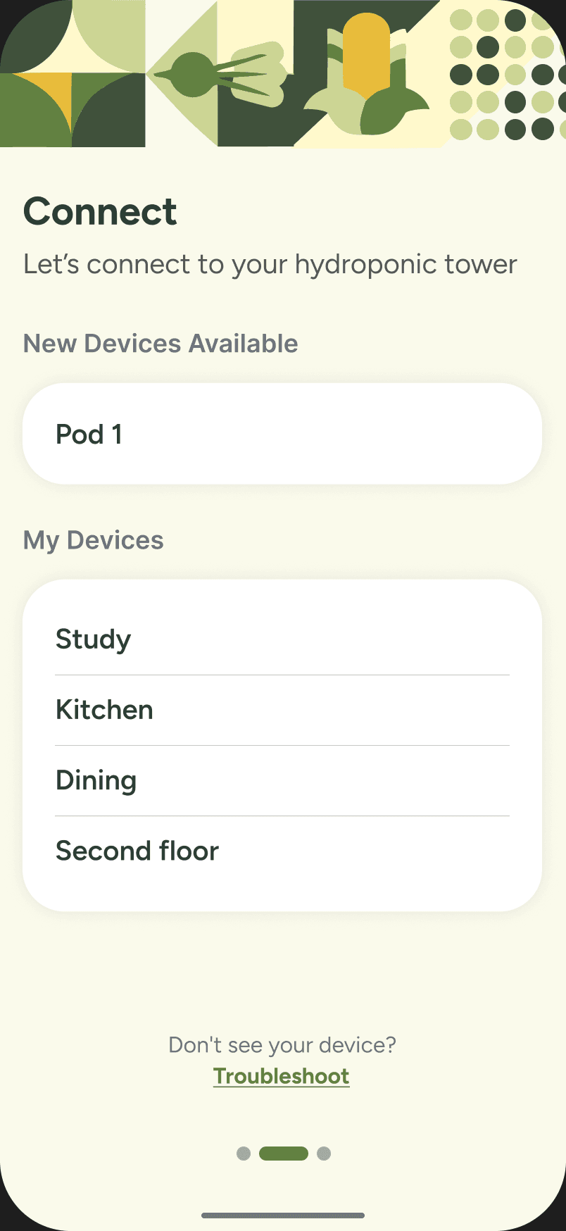
- Three steps: find, connect, name it
- A progress dot row so setup never feels endless
- “No pressure” copy: names can change later
Onboarding in three steps
Welcome, find the tower, connect, give it a name. Then you are growing.



Small decisions, screen by screen
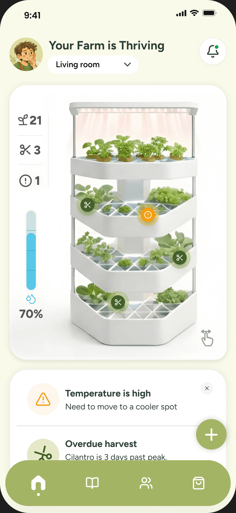
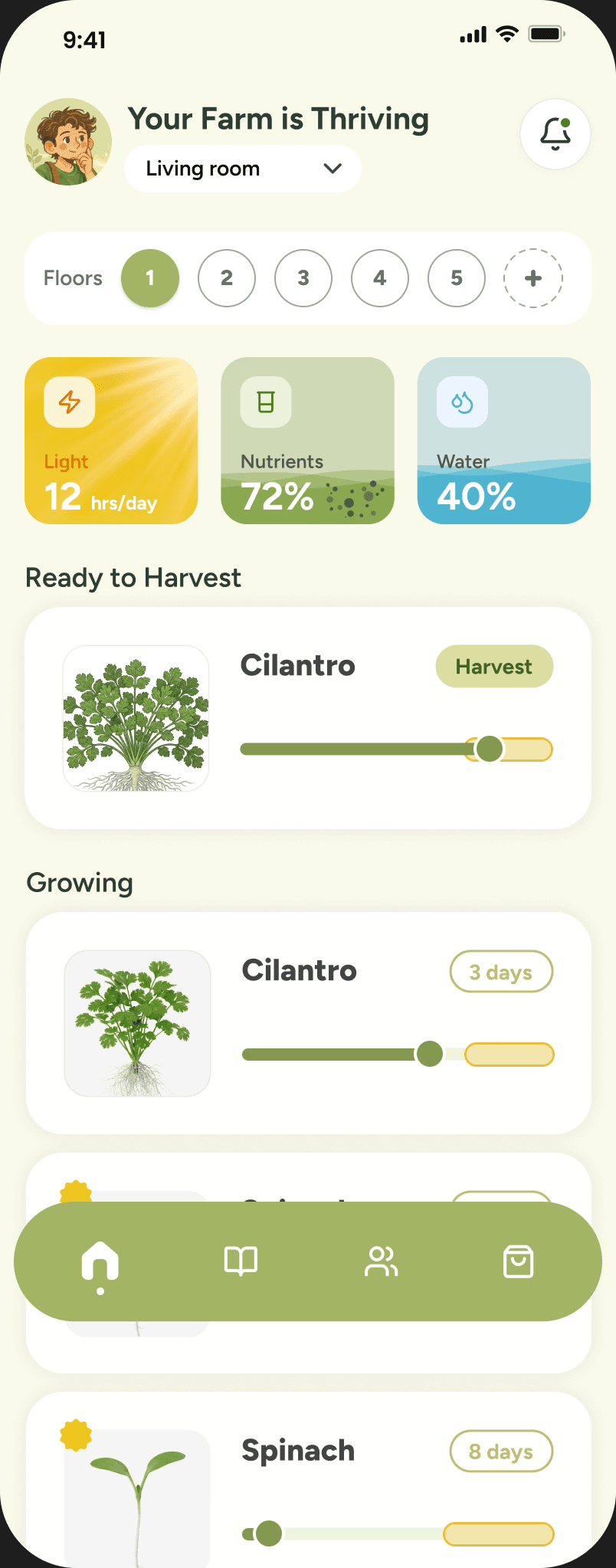


Home. Hover the dots to see the decision behind them.
A design system that feels like a garden
Earthy greens, one sunny accent, soft corners. Built in Figma as components, used across all four flows.
App UI · click to copy
Brand, packaging and print

We designed the company, too
Unlike my other projects, this one went past screens: business model, go-to-market, team, ethics and a three-year roadmap.
Three-year roadmap
Projections from our business plan, with break-even expected early in Year 3.
Lifetime value to acquisition cost
Good UX here is a growth lever: smoother onboarding means more first harvests and more refills.
What we built first, and what waited
Every feature was sorted by one question: would a first-time grower miss it?
Missing any of these, and people stop trusting the tower.
- Safe hardwareWater and electricity on a kitchen counter. Not up for debate.
- Reliable wateringThe base tops up every floor for up to four days.
- Basic monitoringWater and light at a glance, so nothing dies quietly.
- Clear alertsOnly when action is needed: refill, nutrients, harvest.
If Harvesto shipped tomorrow
We didn't get to test with real growers, so these are projections and targets, grounded in research and our plan.
pesticides needed: clean food, grown indoors
By designDays to first harvest
Typical indoor hydroponic timings from seed. Real growth varies with light and variety.
Targets we set
what I’d test first: onboarding and the first two weeks, with first-time growers
and then… two juries agreed

Red Dot Award: Design Concept 2026

European Product Design Award 2026
Why this one is personal
I’ve always loved growing my own plants, especially herbs. There’s something special about having fresh ingredients within reach and knowing exactly where your food comes from.
All four of us had moved away from home to study, and we quickly realized how difficult it could be to access fresh, homegrown food in a new city.
Harvesto isn’t meant to replace grocery shopping. It’s about bringing fresh greens closer to everyday life, while helping families reconnect with food, nurture a little patience in their children, and grow a deeper appreciation for the planet.
What I learned
Calm is a decision. Every sensor, alert and screen we cut made the product easier to trust.
Strategy shapes UI. Pricing pushed us to fewer sensors, and fewer sensors gave us a simpler app.
 the team, on presentation day
- Sanskruti DeshpandeUser research lead, UI & prototype lead
- Pranay PatidarProject lead, UX strategist
- Alex BivinsUX design lead, content lead
- Huong (Hazel) DoVisual design lead, branding lead
- Prof. Byeong Cheol (BC) HwangProfessor, Leading UX